Cesium系列(4)--自定义Popup框
Cesium自定义Popup框
在习惯了二维的Popup框之后,也想在三维里面有个。但是Cesium并没有封装过Popup框,有的只是一个悬浮固定位置的信息框,就是这样的:
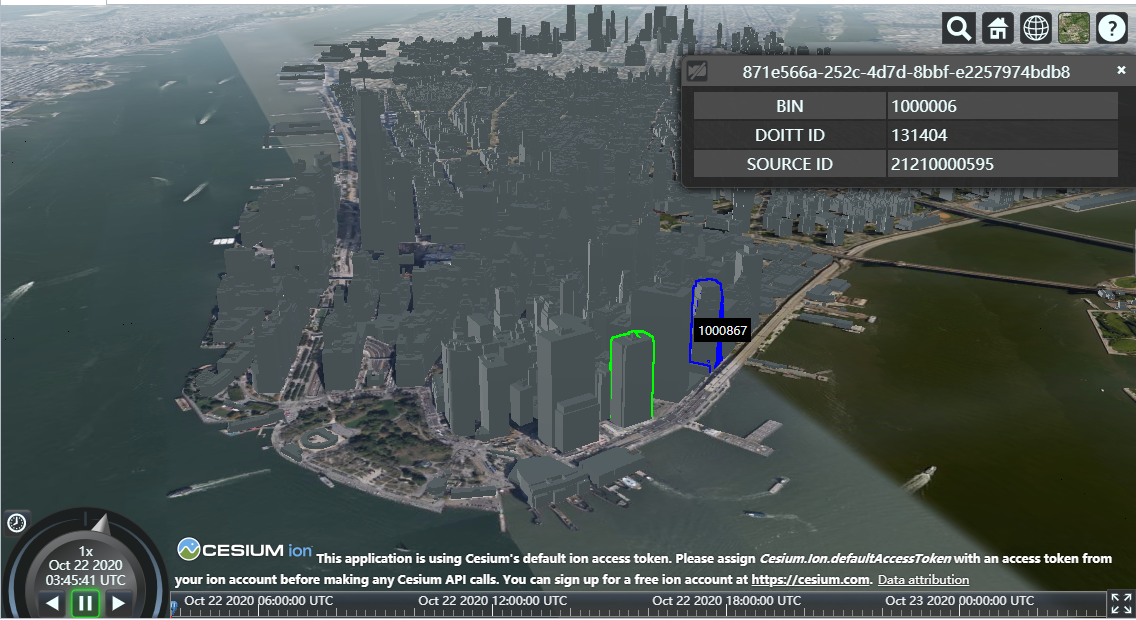
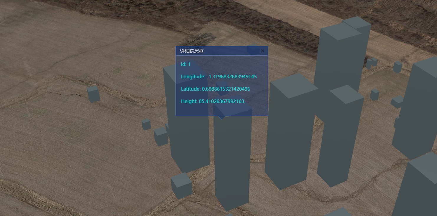
显然这种框框展示,并不能满足狂拽酷炫diao炸天的特效,既然没有,那就照着二维的地图框架,自己整一个吧。先上图:
来个动的:
实现
在做三维之前,那时候用的最多的是 MapBoxGL,所以我就以 MapBoxGL 的 Popup 为基础原型进行的封装。先说一下思路
- 用js来动态创建弹窗的基础DOM框架。包括弹出框的名称,弹窗内容,弹窗的底部尖尖头。
- 利用Cesium提供的实时帧渲染方法,来不停的修改弹出框的位置。
- 然后就是完善和丰富整个功能了。
创建面板代码:
CesiumPopup.prototype.initPanle = function () {

    var closeBtnIcon = '<svg t="1603334792546" class="icon" viewBox="0 0 1024 1024" version="1.1" xmlns="http://www.w3.org/2000/svg" p-id="1328" width="32" height="32"><path d="M568.922 508.232L868.29 208.807a39.139 39.139 0 0 0 0-55.145l-1.64-1.64a39.139 39.139 0 0 0-55.09 0l-299.367 299.82-299.425-299.934a39.139 39.139 0 0 0-55.088 0l-1.697 1.64a38.46 38.46 0 0 0 0 55.09l299.48 299.594-299.424 299.48a39.139 39.139 0 0 0 0 55.09l1.64 1.696a39.139 39.139 0 0 0 55.09 0l299.424-299.48L811.56 864.441a39.139 39.139 0 0 0 55.089 0l1.696-1.64a39.139 39.139 0 0 0 0-55.09l-299.48-299.537z" p-id="1329"></path></svg>'

    _panelContainer = document.createElement('div')
    _panelContainer.classList.add('cesium-popup-panel')
    if (this.className && this.className !== '') {
      _panelContainer.classList.add(this.className)
    }

    _closeBtn = document.createElement('div')
    _closeBtn.classList.add('cesium-popup-close-btn')

    _closeBtn.innerHTML = closeBtnIcon

    // header container
    var headerContainer = document.createElement('div')
    headerContainer.classList.add('cesium-popup-header-panel')

    this.headerTitle = document.createElement('div')
    this.headerTitle.classList.add('cesium-poput-header-title')
    this.headerTitle.innerHTML = this.title

    headerContainer.appendChild(this.headerTitle)
    _panelContainer.appendChild(_closeBtn)

    _panelContainer.appendChild(headerContainer)

    // content container

    _contentContainer = document.createElement('div')
    _contentContainer.classList.add('cesium-popup-content-panel')
    _contentContainer.innerHTML = this.content

    _panelContainer.appendChild(_contentContainer)

    //tip container
    var tipContaienr = document.createElement('div')
    tipContaienr.classList.add('cesium-popup-tip-panel')

    var tipDiv = document.createElement('div')
    tipDiv.classList.add('cesium-popup-tip-bottom')

    tipContaienr.appendChild(tipDiv)

    _panelContainer.appendChild(tipContaienr)

    _panelContainer.style.display = 'none'
    // add to Viewer Container
    _viewer.cesiumWidget.container.appendChild(_panelContainer)
    this.emit('open')

  }
实时更新面板位置(核心代码)
CesiumPopup.prototype.addTo = function (viewer) {
    if (_viewer) this.remove()
    _viewer = viewer
    this.initPanle();
    //关闭按钮
    _closeBtn.addEventListener('click', this.closeHander, false)
    if (this.position) {
      _panelContainer.style.display = 'block'
      _renderListener = _viewer.scene.postRender.addEventListener(this.render, this)
    }

    return this
  }
CesiumPopup.prototype.render = function () {
    var geometry = this.position
    if (!geometry) return
    var position = Cesium.SceneTransforms.wgs84ToWindowCoordinates(_viewer.scene, geometry)
    if (!position) {
      return
    }
    if (_panelContainer) {
      _panelContainer.style.left = position.x - _panelContainer.offsetWidth / 2 + this.offset[0] + 'px';
      _panelContainer.style.top = position.y - _panelContainer.offsetHeight - 10 + this.offset[1] + 'px';
    }
}代码中用到Cesium提供的实时渲染事件:postRender ,此外还有 preRender ,preUpdate,postUpdate,具体详细去文档查看Scene
功能和事件
方法:
- 设置弹窗标题的方法 setTitle(title:String)
- 设置弹窗位置方法 setPosition(position:Cesium.Cartesian3)
- 设置弹窗内容方法 setHTML(html:HTML)
- 设置弹窗偏移量方法 setOffset(offset:Array) 默认[0,0]
- 弹窗添加到Viewer里面 addTo(viewer:Viewer)
事件
- open 弹窗显示事件
- close 弹窗关闭事件
- 初始值
var options = {
  title:String, //弹窗名称
  className: String, //弹窗额外类名
  offset:[0,0] //弹窗默认偏移量
} - 使用示例
var a = new CesiumPopup({
         title:'信息'
   }).setPosition(position).setHTML(html).addTo(viewer).setTitle('详细信息框')

a.on('close',function(){
  console.log('close')
})

a.on('open',function(){
  console.log('open')
}) - 相关样式
/* pop框css*/
.cesium-popup-panel {
opacity: 0.8;
width: 312px;
position: absolute;
z-index: 999;
color: #00fcf9;
background: rgba(23, 50, 108, 0.6);
border: 1px solid #4674d6;
}
.cesium-popup-tip-panel {
width: 40px;
height: 20px;
position: absolute;
left: 50%;
bottom: -20px;
margin-left: -20px;
overflow: hidden;
pointer-events: none;
opacity: 0.8;
}
.cesium-popup-tip-bottom {
width: 17px;
background: rgba(23, 50, 108, 0.8);
border-bottom: 1px solid #4674d6;
height: 17px;
padding: 1px;
margin: -10px auto 0;
-webkit-transform: rotate(45deg);
-moz-transform: rotate(45deg);
-ms-transform: rotate(45deg);
transform: rotate(45deg);
}
.cesium-popup-header-panel {
/* display: flex; */
/* justify-content: space-between; */
align-items: center;
font-size: 14px;
padding: 5px 15px;
background: rgba(23, 50, 108, 0.8);
border-bottom: 1px solid #4674d6;
}
.cesium-poput-header-title {
font-size: 16px;
font-family: Microsoft YaHei;
font-weight: 400;
color: #ffffff;
}
.cesium-popup-content-panel {
padding: 18px;
}
.cesium-popup-close-btn{
float: right;
position: relative;
right: 10px;
}
.cesium-popup-close-btn,
.cesium-popup-close-btn:focus {
cursor: pointer;
}
cesium-popup-close-btn > svg:hover {
color: #00fcf9 ;
}
.cesium-popup-close-btn > svg {
user-select: auto;
color: #4674d6;
cursor: pointer;
width: 15px;
/* height: 15px; */
}代码
完整代码都放到 github 上,需要的移步Cesium-demo-view
音乐小憩
本博客所有文章除特别声明外,均采用 CC BY-NC-SA 4.0 许可协议。转载请注明来自 Jercky!
 微信
微信- 支付宝

相关推荐


评论